Qss
Qss的写法参考css即可。
网站推荐:
Qt Style Sheets Reference | Qt 4.8
书籍推荐:
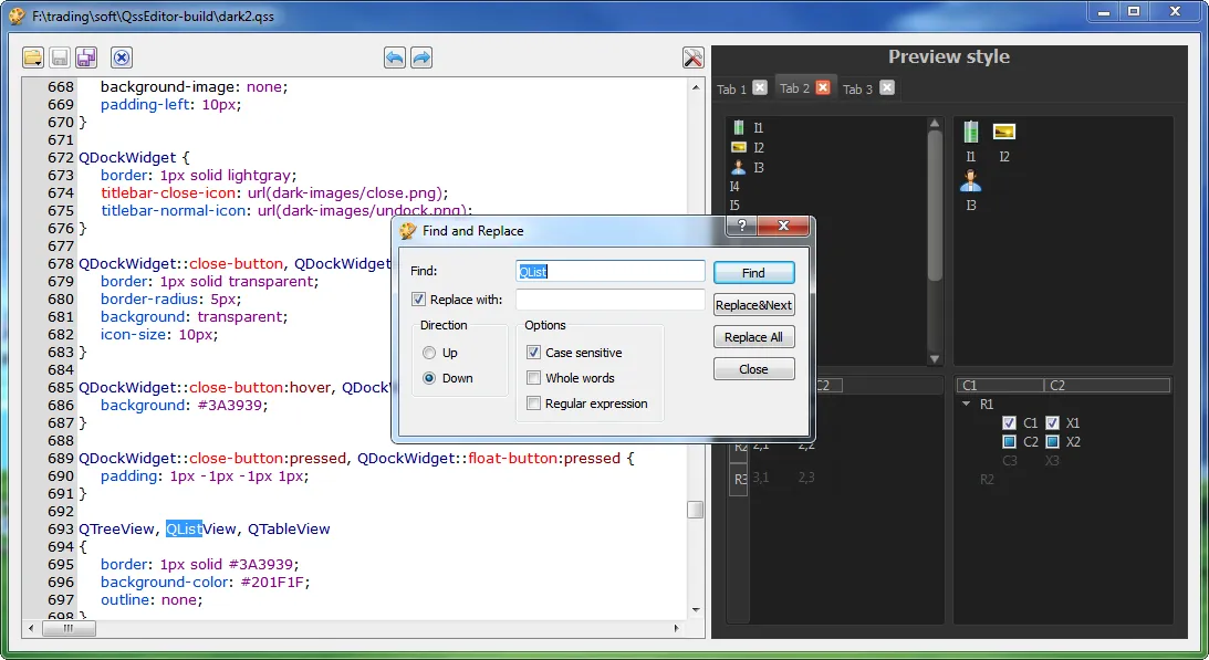
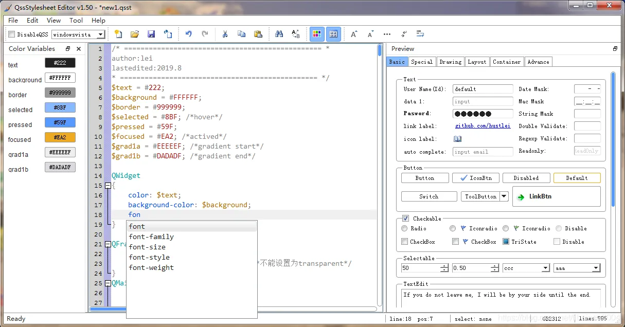
工具推荐:
Qss加载的常规操作
- 在资源文件夹中添加
style.qss的文件 - 以文件IO的方式读取并设置即可。
- 读取的代码:
void Widget::InitStyle(int i)
{
    m_LCD_Hour->setStyleSheet(" font: 18px black;");
    if(i != 0)
    {
        QFile file(QString(":/Assert/qss/style%1.qss").arg(i));
        file.open(QFile::ReadOnly);
        this->setStyleSheet(file.readAll());
        file.close();
        return;
    }

    // m_LCD_Min->setStyleSheet("color: black; ");
    // m_LCD_Sec->setStyleSheet("color: black; ");

    QFile file(QString(":/Assert/qss/main.qss"));
    file.open(QFile::ReadOnly);
    this->setStyleSheet(file.readAll());
    file.close();
}
选择器
一般情况下,在ui文件中的控件有效,而在代码中声明的则无效,因为Qt是根据objectName来识别的,所以自己声明的控件需要设置对象名。
m_btn->setObjectName("BtnOK");在QSS文件中:
QPushButton#BtnOK{
    color:white;
    background-color:rgb(0,112,210);
}
QPushButton#BtnOK::hover{
    background-color: rgb(0,134,252);
}
通用选择器
即 * 表示的css对象。作用于所有的界面控件
* {
    color: red;
}
类型选择器
- 作用于自己及子类
类名(Qt类)作为选择器,作用于其自身和他所有的子类
QFrame {
	background: gray;
}
使用了类型选择器 QFrame,所以 QFrame 和它的子类 QLable,QLCDNumber,QTableWidget 等的背景会是灰色的,QPushButton 不是 QFrame 的子类,所以不受影响。在Qt的类图或者帮助手册中可以看到一个Qt类的子类和父类。
- 只作用于自己
即 . + 类名 的形式。作用对象只有它自己。子类不受影响。
QWidget *window = new QWidget();
window->setStylesheet(".QWidget { "
                      "color:red;"
                      "}");
ID选择器
# + objectname作为选择器。只作用于此 objectname 的对象(多个对象可以设置同一个 objectname,但不推荐这么写)。
QPushButton *btn = new QPushButton;

// 设置属性名
btn->setObjectName("openButton");

// 设置样式
// 1
btn->setStylesheet("#openButton { "
                      "color:red;"
                      "}");
// 2
btn->setStylesheet("QPushButton#openButton { "
                      "color:red;"
                      "}");
属性选择器
[属性 = 值]的形式设置样式。需要通过object->property()接口设置Qt控件的属性值(Dynamic Properties)。
app.setStyleSheet(".QWidget { background: gray; }"
                  "QPushButton[level=\"dangerous\"] { background: magenta; }");

openButton->setProperty("level", "dangerous");
closeButton->setProperty("level", "dangerous");
包含选择器
也就是对控件内的控件的类进行设置,一看就懂,选择器之间用空格隔开,包含选择器和子元素选择器需要区分:
QFrame {
    background: gray;
}

QFrame QPushButton {
    border: 2px solid magenta;
    border-radius: 10px;
    background: white;
    padding: 2px 15px;
}
子元素选择器
选择器之间用 > 隔开,作用于Widget的 直接 子Widget
QFrame {
    background: gray;
}

QFrame > QPushButton {
    border: 2px solid magenta;
    border-radius: 10px;
    background: white;
    padding: 2px 15px;
}
伪类选择器
选择器:状态 作为选择器。支持!操作。
QPushButton:hover { color: white }
QCheckBox:checked { color: white }
QCheckBox:!checked { color: red }
常见的伪类选择器如下所示:
| 伪类 | 说明 |
|---|---|
| :disabled | Widget 被禁用时 |
| :enabled | Widget 可使用时 |
| :focus | Widget 得到输入焦点 |
| :hover | 鼠标放到 Widget 上 |
| :pressed | 鼠标按下时 |
| :checked | 被选中时 |
| :unchecked | 未选中时 |
| :has-children | Item 有子 item,例如 QTreeView 的 item 有子 item 时 |
| :has-siblings | Item 有 兄弟,例如 QTreeView 的 item 有兄弟 item 时 |
| :open | 打开或展开状态,例如 QTreeView 的 item 展开,QPushButton 的菜单弹出时 |
| :closed | 关闭或者非展开状态 |
| :on | Widget 状态是可切换的(toggle), 在 on 状态 |
| :off | Widget 状态是可切换的(toggle), 在 off 状态 |
SubControl选择器
选择器::subcontrol 作为选择 Subcontrol 的选择器。
有些 Widget 是由多个部分组合成的,例如 QCheckBox 由 icon(indicator) 和 text 组成,可以使用 选择器::subcontrol 来设置 subcontrol 的样式:
QCheckBox::indicator {
    width: 20px;
    height: 20px;
}

QCheckBox {
    spacing: 8px;
}
常用的 Subcontrol 有:
| Subcontrol | 说明 |
|---|---|
| ::indicator | A QCheckBox, QRadioButton, checkable QMenu item, or a checkable QGroupBox’s indicator |
| ::menu-indicator | A QPushButton’s menu indicator |
| ::item | A QMenu, QMenuBar, or QStatusBar’s item |
| ::up-button | A QSpinBox or QScrollBar’s up button |
| ::down-button | A QSpinBox or QScrollBar’s down button |
| ::up-arrow | A QSpinBox, QScrollBar, or QHeaderView’s up arrow |
| ::down-arrow | A QSpinBox, QScrollBar, or QHeaderView’s down arrow |
| ::drop-down | A QComboBox’s drop-down arrow |
| ::title | A QGroupBox or QDockWidget’s title |
| ::groove | A QSlider’s groove |
| ::chunk | A QProgressBar’s progress chunk |
| ::branch | A QTreeView’s branch indicator |
补充
一些其他写法的参考demo
/* ================================================ *
author:lei
lastedited:2020.2
* ================================================ */
$text = #222;
$background = #FDFDFD;
$border = #999999;
$selected = #8BF; /*hover*/
$pressed = #59F;
$focused = #EA2; /*actived*/
$grad1a = #EEEEEF; /*gradient start*/
$grad1b = #DADADF; /*gradient end*/

QWidget
{
    color: $text;
    background-color: $background;
}

QFrame{
    color: $text;
    background-color: $background;/*不能设置为transparent*/
}
QMainWindow::separator{
    border: 1px solid $border;
    border-style: outset;
    width: 4px;
    height: 4px;
}
QMainWindow::separator:hover{
    background: $selected;
}
QSplitter::handle{
    border: 1px solid $border;
    border-style: outset;
    width: 4px;
    height: 4px;
}
QSplitter::handle:hover{/*splitter->handle(1)->setAttribute(Qt::WA_Hover, true);才生效*/
    border-color: $focused;
}
QSplitter::handle:pressed{
    border-color: $pressed;
}
QSizeGrip{
    background-color: none;
}

/* =============================================== */
/* Label                                           */
/* =============================================== */
QLabel {
    background: transparent;
    border: 1px solid transparent;
    padding: 1px;
}


/* A QLabel is a QFrame ... */
/* A QToolTip is a QLabel ... */
QToolTip {
    border: 1px solid $border;
    padding: 5px;
    border-radius: 3px;
    opacity:210;
}

/* =============================================== */
/* TextBox                                         */
/* =============================================== */
QLineEdit {
    background: $background;/*不建议设为透明,否则table编辑时会字显示*/
    selection-background-color: $selected;
    border: 1px solid $border;
    border-radius: 2px;
    border-style: inset;
    padding: 0 1px;
}

QLineEdit:hover{
    border-color: $selected;
}
QLineEdit:focus{
    border-color: $focused;
}
/*QLineEdit[readOnly="true"] { color: gray }*/
QLineEdit[echoMode="2"]{
    lineedit-password-character: 9679;/*字符的ascii码35 88等 */
}

QLineEdit:read-only {
    color: lightgray;
}

QLineEdit:disabled{
    color: lightgray;
    background: lightgray;
}

QTextEdit{
    selection-background-color:$selected;
    border: 1px solid $border;
    border-style: inset;
}
QTextEdit:hover{
    border-color: $selected;
}
QTextEdit:focus{
    border-color: $focused;
}
/* =============================================== */
/* Button                                          */
/* =============================================== */
QPushButton {
    border: 1px solid $border;
    border-radius: 2px;
    /*background-color: QLinearGradient( x1: 0, y1: 0, x2: 0, y2: 1,
        stop: 0 $grad1a, stop: 0.05 $grad1b,stop: 0.5 $grad1b,
        stop: 0.9 $grad1a, stop: 1 $grad1a);*/
    padding: 1px 4px;
    min-width: 50px;
    min-height: 16px;
}

QPushButton:hover{
    background-color: $selected;
    border-color: $pressed;
}

QPushButton:pressed
{
    border-width: 1px;
    background-color: $pressed;
    border-color: $border;
}

QPushButton:focus, QPushButton:default {
    border-color: $focused; /* make the default button prominent */
}


QToolButton,QToolButton:unchecked { /* ToolBar里的按钮和带下拉菜单的按钮 */
    border: 1px solid transparent;
    border-radius: 3px;
    background-color: transparent;
    margin: 1px;
}
QToolButton:checked{
    background-color: $selected;
    border-color: $pressed;
}
QToolButton:hover{
    background-color: $selected;
    border-color: $pressed;
}

QToolButton:pressed,QToolButton:checked:hover{
    background-color: $pressed;
    border-color: $focused;
}
QToolButton:checked:pressed{
    background-color: $selected;
}

/* only for MenuButtonPopup */
QToolButton[popupMode="1"]{
    padding-left: 1px;
    padding-right: 15px; /* make way for the popup button */
    border: 1px solid $border;
    min-height: 15px;
    /*background: qlineargradient(x1:0, y1:0 ,x2:0, y2:1
        stop: 0 $grad1a, stop: 0.05 $grad1b, stop: 0.5 $grad1b
        stop: 0.95 $grad1a stop: 1$grad1a)*/
}
QToolButton[popupMode="1"]:hover{
    background-color: $selected;
    border-color: $pressed;
}
QToolButton[popupMode="1"]:pressed{
    border-width: 1px;
    background-color: $pressed;
    border-color: $border;
}
QToolButton::menu-button {
    border: 1px solid $border;
    border-top-right-radius: 2px;
    border-bottom-right-radius: 2px;
    width: 16px;
}


/* =============================================== */
/* Slider ProgressBar                              */
/* =============================================== */
QProgressBar {
    border: 1px solid $border;
    border-radius: 4px;
    text-align: center;
}

QProgressBar::chunk {
    background-color: $focused;
    width: 4px;
    margin: 1px;
}

QSlider{
    border: 1px solid transparent;
}
QSlider::groove{
    border: 1px solid $border;
    background: $background;
}
QSlider::handle {/*设置中间的那个滑动的键*/
    border: 1px solid $border;
    background: $selected;
}
QSlider::groove:horizontal {
    height: 3px; /* the groove expands to the size of the slider by default. by giving it a height, it has a fixed size */
    left:5px; right: 5px;
}
QSlider::groove:vertical{
    width: 3px;
    top: 5px; bottom: 5px;
}
QSlider::handle:horizontal{
    width: 6px;
    margin: -7px; /* height */
}
QSlider::handle:vertical{
    height: 6px;
    margin: -7px; /* height */
}
QSlider::add-page{/*还没有滑上去的地方*/
    border: 1px solid $border;
    background:$grad1a;
}
QSlider::sub-page{/*已经划过的从地方*/
    background: $focused;
}

/* =============================================== */
/* ScrollBar                                       */
/* =============================================== */
QScrollBar{
    background-color: $background;
    border: 1px solid $border;
    border-radius: 5px;
    padding: 1px;
    height: 10px;
    width: 10px;
}
QScrollBar:hover{
    border-color:$selected;
}
QScrollBar::handle{
    border-radius: 3px;
    background: $pressed;
    min-width: 16px;
    min-height: 16px;
}
QScrollBar::handle:hover {
    background: $focused;
}
QScrollBar::add-line, QScrollBar::sub-line,
QScrollBar::add-page, QScrollBar::sub-page {
    width: 0px;
    background: transparent;
}
QScrollArea{
    border: none;
}
/*QScrollArea  QAbstractSlider{
    border-radius: 0px;
}*/
/* =============================================== */
/* DockWidget                                       */
/* =============================================== */
QDockWidget, QDockWidget > QWidget/*not work*/
{
    border-color: $border;/*qt bug*/
    background: transparent;
}
QDockWidget::title {
    border-bottom: 1px solid $border;
    border-style: inset;
    text-align: left; /* align the text to the left */
    padding: 6px;
}

/* =============================================== */
/* GroupBox                                        */
/* =============================================== */
QGroupBox {
    background-color: $background;
    border: 1px solid $border;
    border-radius: 4px;
    margin-top: 0.5em;
}
QGroupBox::title {
    subcontrol-origin: margin;
    subcontrol-pOSItion: top left;
    left: 1em;
	top: 0.1em;
    background-color: $background;
}
/* =============================================== */
/* ToolBox                                         */
/* =============================================== */
QToolBox{
    border: 1px solid $border;
}
QToolBox::tab {
    background: $grad1a;
    border: 1px solid $border;
    border-radius: 1px;
}
QToolBox::tab:hover {
    background-color: $selected;
    border-color: transparent;
}
QToolBox::tab:pressed {
    background-color: $pressed;
    border-color: transparent;
}
QToolBox::tab:selected {
    font-weight: bold;
    border-color: $selected;
}

/* =============================================== */
/* TabWidget                                       */
/* =============================================== */
QTabWidget{
    margin-top:10px;
}
QTabWidget::pane{
    border: 1px solid $border;
}
QTabWidget::tab-bar {
    left: 0px;
}
QTabBar::tab {
    background: $background;
    border: 1px solid $border;
    padding: 3px 5px;
}
QTabBar::tab:hover {
    background: $selected;
    border-color: transparent;
}
QTabBar::tab:selected {
    background: $selected;
    border-color: $pressed;
}
QTabBar::tab:pressed {
    background: $pressed;
    border-color: transparent;
}
QTabBar::tab:focus {
    border-color: $focused;
}
QTabBar::tab:top{
    margin-top: 3px;
    border-bottom: transparent;
    margin-right: 1px;
}
QTabBar::tab:bottom{
    margin-bottom: 3px;
    border-top: transparent;
    margin-right: 1px;
}
QTabBar::tab:left{
    border-right: transparent;
    margin-bottom: 1px;
}
QTabBar::tab:right{
    border-left: transparent;
    margin-bottom: 1px;
}

/* =============================================== */
/* QHeaderView for list table                      */
/* =============================================== */
QHeaderView {
	border: none;
	margin: 0px;
	padding: 0px;
}
QHeaderView::section, QTableCornerButton::section {/*设置表头属性*//*左上角*/
	background-color: $grad1a;
	padding: 0 3px;
	border-right: 1px solid $border;
	border-bottom: 1px solid $border;
	border-radius: 0px;
}
QHeaderView::section:hover, QTableCornerButton::section:hover{
    background-color: $selected;
}
QHeaderView::section:pressed{
    background-color: $pressed;
}
QHeaderView::section:checked {
    background-color: $focused;
}

/* =============================================== */
/* QTableWidget                                    */
/* =============================================== */
QTableWidget, QTableView
{
    gridline-color: $border;    /*表格中的网格线条颜色*/
    background: $background;
    /*设置交替颜色,需要在函数属性中设置:tableWidget->setAlternatingRowColors(true)*/
    alternate-background-color: $grad1a;
    /*selection-color:$background;    鼠标选中时前景色:文字颜色*/
    selection-background-color:$selected;   /*鼠标选中时背景色*/
    border:1px solid $border;  /*边框线的宽度、颜色*/
    /*border:none;    去除边界线*/
    /*border-radius:5px;*/
    /*padding:10px 10px;*/  /*表格与边框的间距*/
}
QTableView::item, QTabWidget::item{
    background: transparent;
	outline-style: none;
	border: none;
}

QTableView::item:hover {
	background: $selected;
    border: 1px solid $focused;
}

QTableView::item:selected {
	background: $selected;
	color: $grad1a;
}

QTableView::item:selected:active {
	background: $pressed;
	color: $grad1a;
}

QTableWidget QComboBox{
    margin: 2px;
    border: none;
}